Assessing the shape of customer experiences
To assess customer experiences is to embark on a complex but profitable journey. The desire to make improvements is compelling and yet the starting point and finish line are not always obvious. The Customer Experience Triangle concept has been designed to help shape the thinking that makes planning easier and direction clearer.
Is your Customer Experience Triangle a perfect 10-10-10?
Whatever the customer experience, it can be deconstructed into three key, interdependent components: functionality, accessibility and emotion. Three simple dimensions to quickly assess how good – or not – an experience is.
As customers, we do this subconsciously when we do business with a company; it’s important because the result affects whether we’ll do the same again.
As customer experience professionals, it’s a powerful way to understand how well we do the things that are most important to our customers and our business. It then becomes a structured and visual way of thinking about where the priorities, investment and resource should be focused next.
The three elements are inextricably linked. In other words,
- Functional: was the customer able to do what they needed to do?
- Accessibility: how easy was it?
- Emotion: how did it make them feel?
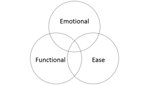
Fellow CCXP and Custerian colleague Ian Golding writes excellent customer experience reviews using this as the basis – do make time to check him out at ijgolding.com. The premise is that the whole experience is a combination of the three elements. It might look something like this, where the sweet spot is in the middle.

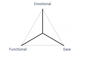
If we take the concept a stage further it becomes a very useful tool to assess how well we do the things that really matter – and therefore show where the focus for what to do next lies. To assess each element in its own right and against the other two, we can use another simple visualistion of the same three dimensions.

By giving each element a score, the customer experience starts to take shape. We, our colleagues, customers and stakeholders will all have a view. Indeed, customers surveys are finding answers to these questions more useful than surveys that have metric-focused outputs. The scale, radiating out from the centre, can be whatever works for your business, but may for example be
- Functional: 1 (not as expected) > 5 (as expected) > 10 (better than expected)
- Accessibility: 1 (huge effort) > 5 (ok) > 10 (very easy)
- Emotion: 1 (Angry) > 5 (satisfied) > 10 (elated)
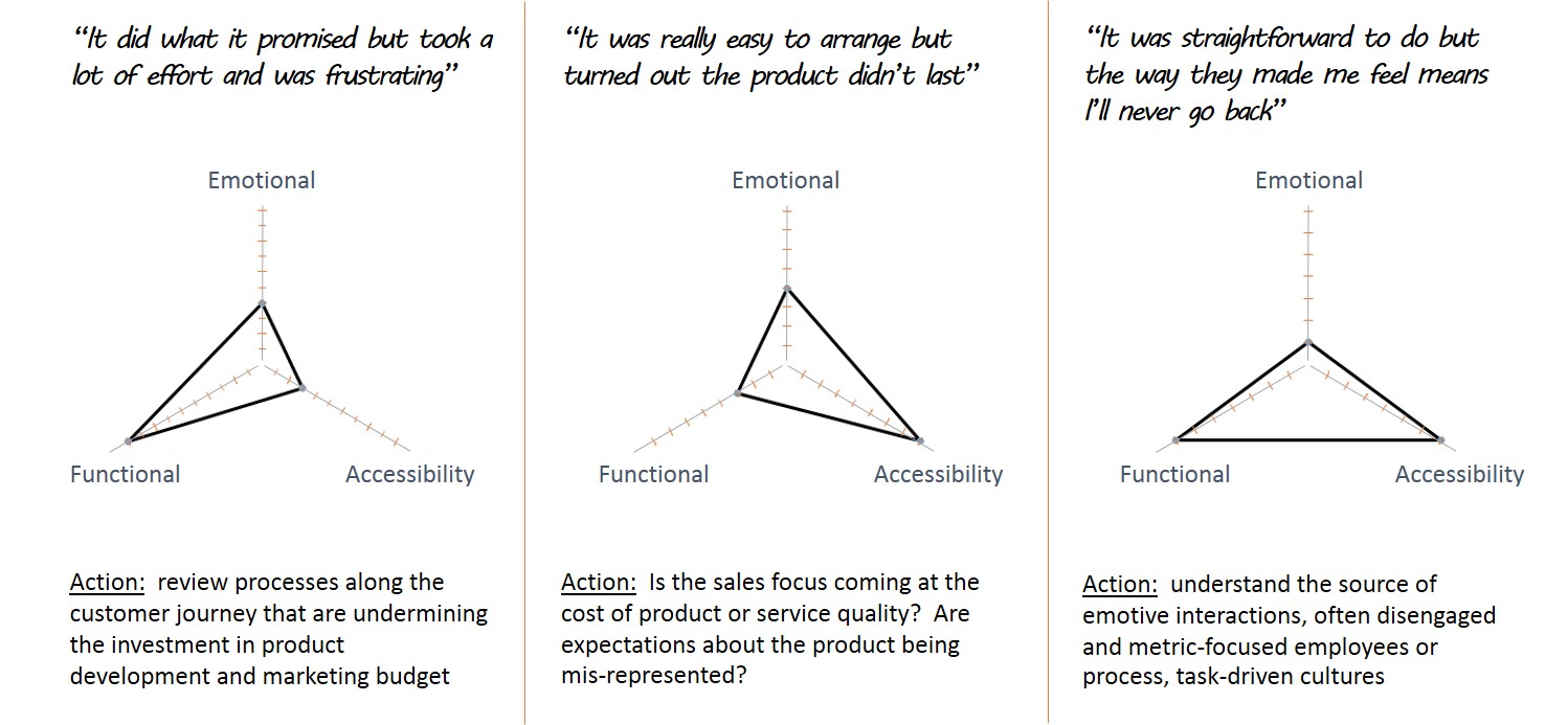
The best result is when the shape is the largest, equilateral triangle possible: 10 out of 10 for each. That means that none of the critical dimensions can be improved upon. If it’s anything smaller or skewed, we have a clear visualisation of where there is room for improvement. Here are some examples, with what customers might say and what might be done:

The Customer Experience Triangle TM concept can be overlaid with a metric to track the progress of improvement activity over time. In reporting schedules, it holds people to account for change. Rather than sharing one generic headline number around the organisation, a score of say 3-7-5 (for function – ease – emotion respectively), immediately points to areas that are in need of improvement.
However, the real value in this approach is in organising the thinking and in the visualisation of what to do next. Without using it to drive change, it will be just a vanity project. In the same way, a score is a nice-to-have but that’s not the ultimate goal – as I always say, get the experience right first and the score will take care of itself.
So as a new year looms over the horizon I hope this gives you some food for thought about how to get your customer experiences in shape for 2015. The perfect 10-10-10?
(The Customer Experience Triangle is subject to Trademark and Copyright, Jerry Angrave, UK, 2014)

Leave a Reply
Want to join the discussion?Feel free to contribute!